I know this isn’t really craft related but it is craft blogging related. I love Instagram. The only problem with it is that you only get one link to share. This helps Instagram stay relevant and free from crazy stuff and links but it does make it harder for you as a blogger to point your fans and peeps in the right direction. If they had to search on your blog for a specific post they probably won’t.
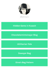
At first I used using Linktree. Which is great but you can’t really control how the page looks and I wanted more control over it. And you could only add links that looked like green boxes

So I did what people do. I googled. I couldn’t find what I needed. All of the posts gave instructions to create a regular link page.
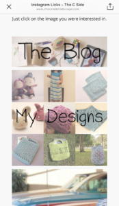
Some tinkering later and it is live. If you check out my Instagram feed now and click on the bio it will take you to the page that I created. It is designed to look better on your phone. This is what it looks like now. I can easily add or remove links and their respective images and have total control over the design. I can also look at the analytics since it is just part of my website anyway. Form + Function.

Here’s how I did it:
1. Created a template for pages that would hide the header, menubars, sidebars and the footer and all of the extras you get from WordPress. I used this tutorial.
2. Save that file in your Themes folder.
3. Create a new page in WordPress and make sure that the template is the one you just made and uploaded.
4. Add the images and the links. I center aligned the entire page so it would look better. You can add whatever text you want or links.
That’s it. The next time you need to add a new link all you need to do is to just add the new image and link. This is great for new blog posts that you might want people to checkout from Instagram or freebies that you are sharing. It could link to your other social media pages, the world is basically your oyster at this point.

